This tutorial assumes that you’ve used Xcode before and are familiar with Interface Builder, but not with Auto Layout tools in Xcode.
At WWDC 2012 Apple introduced a new system for laying out interfaces. Auto Layout is an incredibly capable layout engine perfect for applications. While a little strange to understand at first, once mastered it allows for much more fluid layouts with significantly less (or perhaps no) layout logic in code.
Since 2012, Auto Layout has featured again and again, with considerable tool improvements. Suggesting that Auto Layout (and now Size Classes) is Apple’s solution for multi-resolution support.
The Concept
In Auto Layout, rather than setting the position and size of a view you create constraints between views. These are used to calculate each view’s position and dimensions. For example you may think about positioning an element by using:
myView is at position (x: 20, y: 40) with dimensions (w: 400, h: 100)
In Auto Layout something this would be said as:
myView’s leading edge matches its superview’s offset by 20pt
myView’s top space matches its superview’s offset by 40pt
myView’s width is equal to 400
myView’s height is equal to 100
That sounds a lot wordier, but this way of thinking allows for more possibilities. For example, we could change the first line to say:
myView’s leading edge matches the trailing edge of myOtherView
To put two views next to each other. Likewise we could change the third line to say:
myView’s width matches the width of myOtherView
To make them the same size.
Without Auto Layout you could do something equivalent by manipulating frame values within a layout method but I’m sure you can see how expressive Auto Layout is through this example.
In Practice
Lets try out Auto Layout ourselves by creating the screen for an Article reading app in Xcode. Let’s first look at what we want to achieve, and then step through how we can achieve that.
You can find the github for the project here.
Imagine we’re creating an app for reading articles, something like the Medium app. Our designer has given us a (rather rough) design of how they want the article page to look.
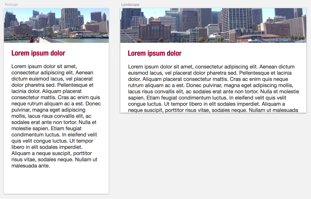
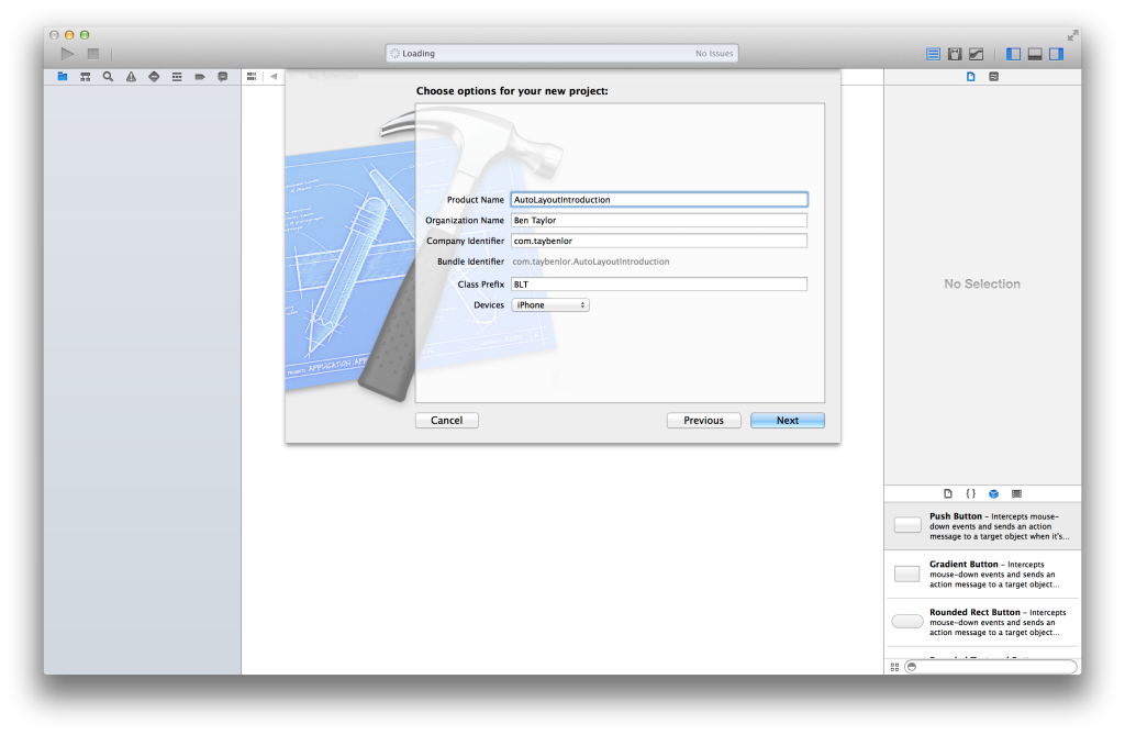
Now we have a design, lets work on replicating it, open up Xcode and create a new project.
Once we have a project, open up the storyboard (Main.storyboard) and drag out the view components we’ll need. Namely an UIImageView, an UILabel and an UITextView. Place them to create a suitable portrait layout as demonstrated below.
You may want to place a dummy image in the top UIImageView and set it cropped nicely. I’ve selected View Mode Aspect Fill and Clip Subviews.
Lets have a look at what happens when we adjust the height vertically, you can do this with the button at the bottom of the screen labelled Apply 3.5 Inch Form Factor, it looks like ![]() . You’ll notice that instead of resizing the text view, it simply gets cut off.
. You’ll notice that instead of resizing the text view, it simply gets cut off.
If that’s what happens when we resize vertically, what do you expect will happen when we rotate the screen? The best way to find out is to try.
It’s clear that this is not the effect we’re looking for. We want everything to stretch and shift as we rotate or resize and just positioning things won’t have that effect.
Instead lets look at Auto Layout.
The easiest way to create constraints within your Storyboard is to click the “Pin” button. It looks like this ![]() . Once you click it you’ll see a dialog pop up for creating constraints (Select the image before clicking it). The top section has the four edges of your view and their nearest neighbor, for the image that’s the edges of the container and the label at the bottom. We want this image to stick to the edges of the container so we’ll tap those to select them. Then we want it to stay at the same height, so we’ll tap that one as well.
. Once you click it you’ll see a dialog pop up for creating constraints (Select the image before clicking it). The top section has the four edges of your view and their nearest neighbor, for the image that’s the edges of the container and the label at the bottom. We want this image to stick to the edges of the container so we’ll tap those to select them. Then we want it to stay at the same height, so we’ll tap that one as well.
We’ve added our first constraints! Now if we run the app we’ll be able to see our image stretching as we rotate the device.
There’s more than one way to add constraints from the Storyboard. You can also right-click + drag from a view to another view. This is useful for creating specific relationships between views. For the heading label we want to create a vertical spacing relationship between the image view and the label. This means that the bottom of the image view will match the top of the label (plus some offset).
Once you’ve set this you’ll notice a red dashed box appearing on the screen. This means that there is an inconsistency between where you’ve placed the view visually and where Auto Layout thinks it should be. Right now we only have one constraint so Auto Layout doesn’t quite know where to place the view, we need to add more constraints for it to work. We want two more constraints, one for the leading edge (left hand side) and one for the trailing edge (right hand side), and we want them to align to the container. So again right-click and drag from the view, but this time select the container (the view surrounding it).
So far we’ve created constraints based on where the views are already, but what if we’ve placed them wrong? If your like me you probably placed the label with unequal margins on each side. Try dragging out the width of the label, you’ll notice that we get another red box and some yellow indicators. The yellow ones display the visual point difference between the constraints and what is shown on screen. To edit a constraint we can click on it directly. Click on any that are yellow and edit them so that the value matches what we want.
You can also edit constraints by finding them in the view hierarchy on the left (opened with ![]() )
)
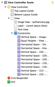
Or from the size inspector on the right.
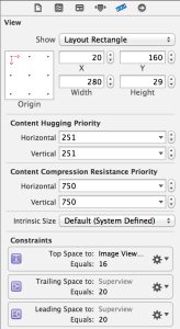
Finally, to the text view. Lets do what we did originally, open the Add New Constraints dialog and select all four edges. This time however we’ll edit the values in those four boxes. We want them all to be 10.
Now if we click away we’ll see the same red dashed box and yellow highlights. This time instead of trying to fix it manually, we’ll have Xcode fix it for us. Click the Resolve Auto Layout Issues button ![]() . Then click
. Then click Update Frames to have the visual appearance update to match Auto Layout.
Run the app and see everything moving around magnificently!
Stretch Goal
If you feel like stretching your new found Auto Layout knowledge, try making it so that the image’s height is proportional to the height of the superview. Meaning that it will take up, say, 1/4 of the screen making it much smaller when the screen is wide, but big when the screen is tall. Tip: an Auto Layout constraint can have a multiplier as well as a constant.
Extra Details
There are also many ways to create and refer to constraints from code. For example a constraint can be paired with an Outlet in the same way that a View can. You can create constraints in code by creating lots of NSLayoutConstraint objects or by using the NSLayoutConstraint visual string format. There are also CocoaPods for creating Constraints, my favorite is Masonry.
Further Reading
 Ben Taylor
Ben is a Software Developer and Interaction Designer with a passion for making highly interactive, well designed and useful pieces of software. He works with the team at Shiny Things making educational apps for kids.

