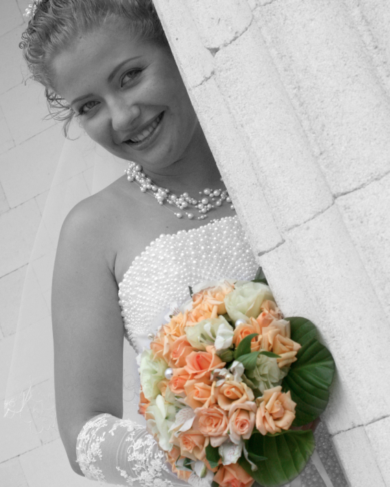
Some say that a picture is worth a thousand words. And, the more impact that picture has, the more it has to say. The right image can be used to garner attention and tell a deliberate story with careful alterations. That’s why image enhancement plays such a major role in design and photography. With Photoshop, we can enhance an image to emphasize any element. One technique to emphasize an image is to turn it into a selective color image by adding color to a key element of the image to create a bold, colorful focal point. The following technique is used in creative advertisements, dramatic public service announcements, and especially in wedding photography.
Choosing The Right Photo
Applying effects to your imagery is great, but choosing the right image is a pivotal first step in creating a powerful photograph. You will want to consider the application and context in which you are using the photo.
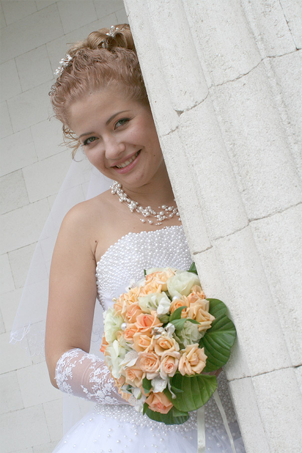
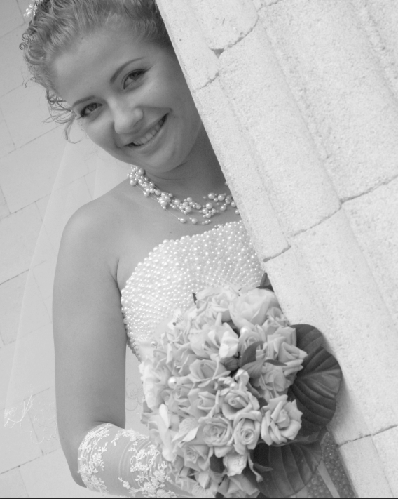
Choosing the proper format and the right size is important as well. For example, if you are working on a wedding photo, it will most likely be printed. All wedding photos should be no less than 300 dpi, or dots per inch. This ensures that your images will be crisp and beautiful when it’s printed. If you provide print services, then you will want to crop the image to standard photo sizes, such as 8″ x 10″ for a large portrait. Wedding photos are special, so in this case you want them to be as large as possible, because some couples will order poster-sized images to commemorate the occasion. The image below is cropped as an 8″ x 10″ photo. You can download the sample image here.
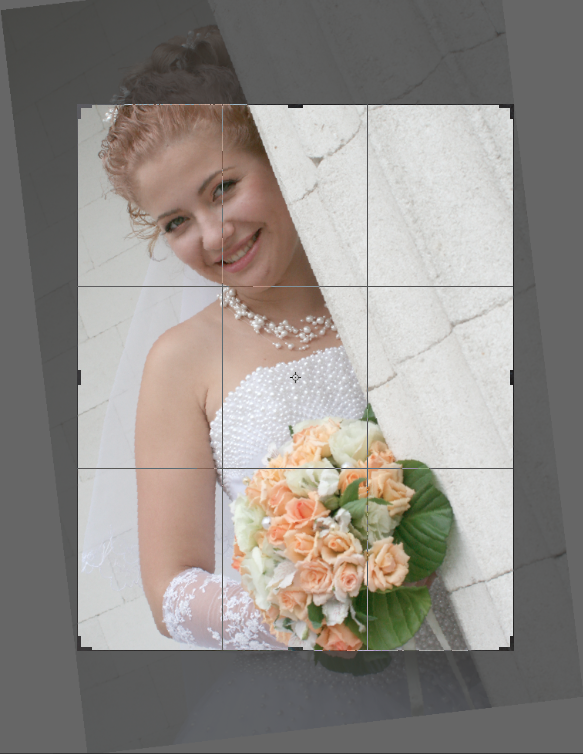
To use an effect like selective color image technique, it is also important to choose the right composition. The intersections of the four lines above are considered focal points. Since the image already had a tilt to it to begin with, I rotated the image slightly during the cropping process so that the face would fall near to the top-left focal point and the bouquet would be aligned with the bottom-right focal point. This is a key factor when composing any image or design.
Always try to align something important with one of these areas. Notice that when I rotated, I stayed within the boundaries of the image in order to keep from having to clone the background or use Photoshop’s Content Aware Fill.
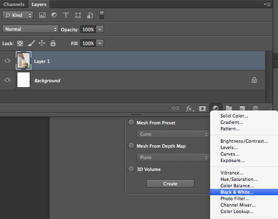
Next, click on the “New Adjustment Layer” icon and choose “Black & White.” Creating a new adjustment layer is much better than applying it to your image using the “Image” > “Mode” > “Adjustments” method. When working with any photograph, you want to be as non-destructive as possible, especially with selective color images. Using this method places your effects on a new layer with its own layer mask pre-made.
Another advantage to this technique is that it’s infinitely editable. If you need to go back and make an adjustment, you simply double-click the adjustment layer and edit the values in the properties panel.
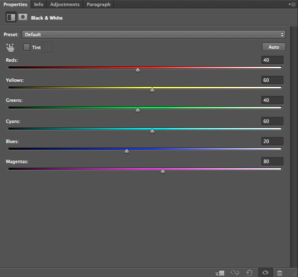
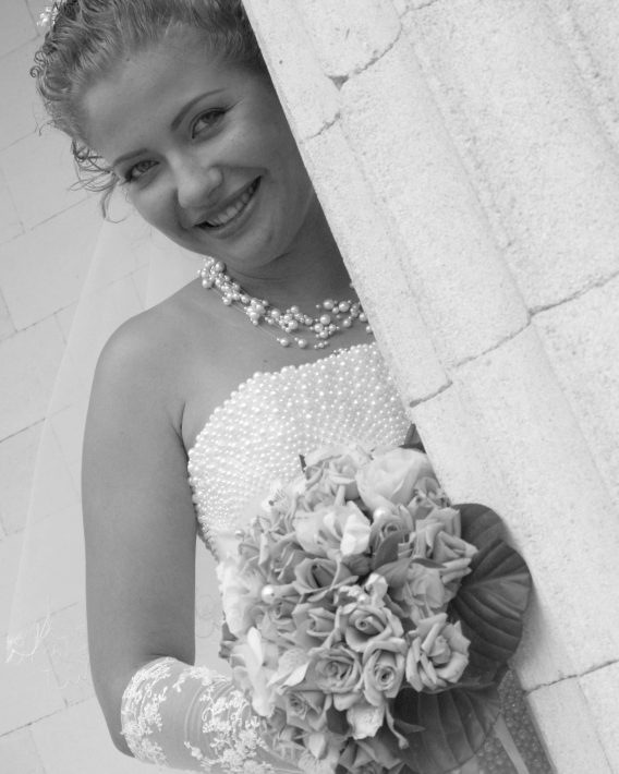
The reason Black & White works so well for the selective color image effect is that you can control the tones of the image with each slider. This is great with black and white, because you can selectively add contrast by increasing and decreasing values of the slider. You can see below that the bride’s skin doesn’t have enough contrast against the stone pillar. She tends to blend in, which is not what we want. When adding the color back in, we want the focus to be on the bouquet first, then her, and the environment should be noticed last.
This image was a good one for this effect, because by simply decreasing the value of the red slider to -15, we made her stand out more, and if you toggle the Black & White layer off, you’ll see that her flowers are peach in color, which has a lot of red in it, so we ended up adding contrast to the flowers at the same time. This will disappear when we mask out the flowers and add the color information back in.
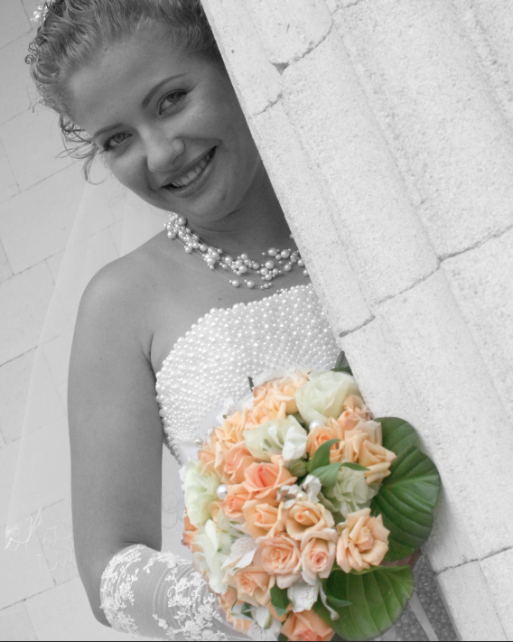
In the layers panel, click on the mask icon on the Black & White layer. Select black as your foreground color. Choose a soft edge brush and begin painting black on the mask over the areas of the image where you want to bring color back in. I would suggest masking the flowers and the leaves back in. The results are shown below:
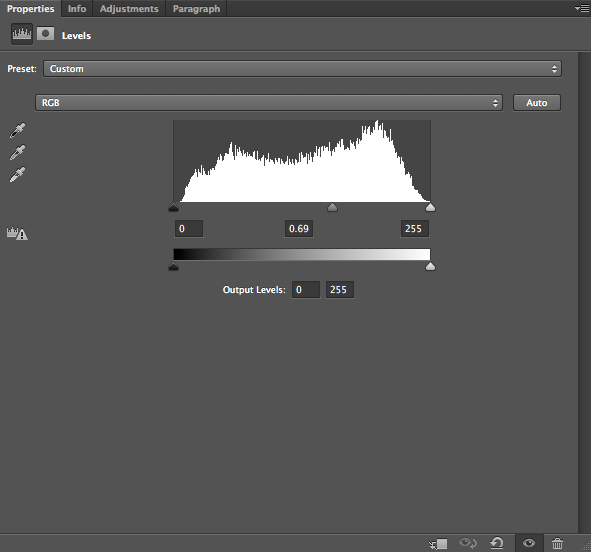
Now, if you decide that the bouquet could stand to use a little extra contrast in the gray areas of the image, you can create a levels adjustment layer. Move the grey slider (The middle one) so that its value is roughly 0.69. I’ve included an image below for clarity.
You don’t want to apply this to the entire image, so hold down Option/Alt, and click on the layer mask from the Black & White adjustment layer and drag it (While still holding down on Alt/Option) to the levels adjustment layer. This will copy the layer mask and place it on your levels adjustment layer. Alt/Option-click on the layer mask icon and hit Command/Ctrl + “I” to invert the layer mask, hiding the levels adjustment from the rest of the image, while keeping the effect on the bouquet. You can see the difference in the image below.
Other Examples of Selective Color Images
You could use them to spruce up a dull photo. For example the image below, found here, is of a rusted old Chevy next to a pile of wood on a dusty plain. The overall tone of the image is brown, brown, and more brown. You can save this image and add a little drama by making it a selective color image. I used the same technique above, masking the Chevy back into color.
Using this technique adds a sense of drama or contrast on top of the tonal contrast of the image. It adds a small sense of shock and draws your eye immediately to that point in the image.
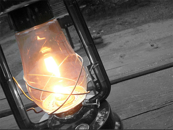
The image below is of a lantern, and the original image isn’t bad, but if you look at the image after we converted it to a selective color image, the latter really gets your attention. The golden glow contrasts well with the black and white and makes the lantern stand out prominently.
Conclusion
Creating colorful highlights within black & white images is a great way to add an extra level of focus to your images to make them stand out. The added drama sets a strong mood and establishes the tone of the image. The splash of color adds a great deal of emphasis to carefully-chosen parts of an image, as we did with the bouquet of flowers. When you combine this with the alignment of key elements onto the focal points of your image, you get a powerful image that evokes a lot of emotion and adds an element of the unexpected.
Have you ever selectively colored your images? How did your clients react to these images. Share your experiences in the comments section below.
James George is a professional web developer and graphic designer. James is an expert in design, and a professional web developer, with a special interest in WordPress. Founder of Design Crawl, James has been a professional designer since 2005.
